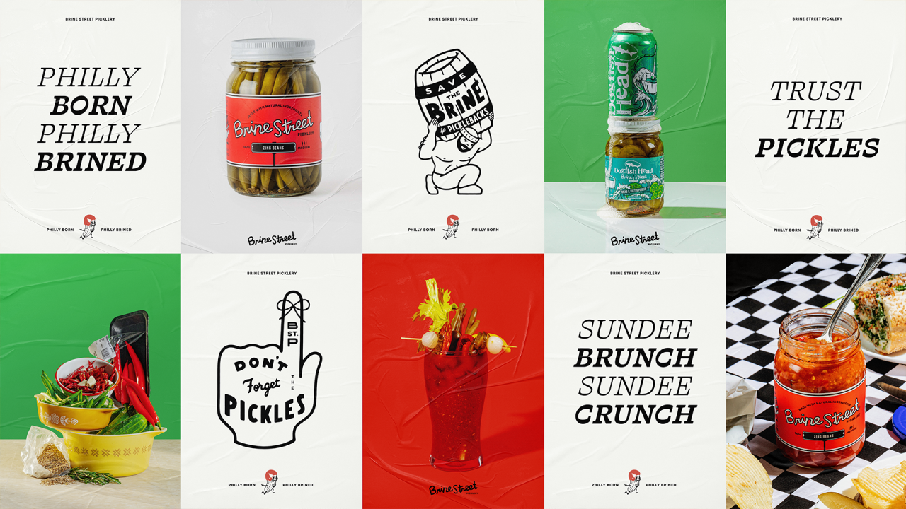
Infusing Philly attitude into a homegrown pickle company.
When Brine Street launched in 2014, they needed a brand that would help differentiate themselves in a crowded “craft pickle” landscape. Our challenge was to create a look and feel that could carry them from a farmers market start to a nationwide presence, infusing it with a polished authenticity at home on both an upscale charcuterie board and at a backyard barbecue.
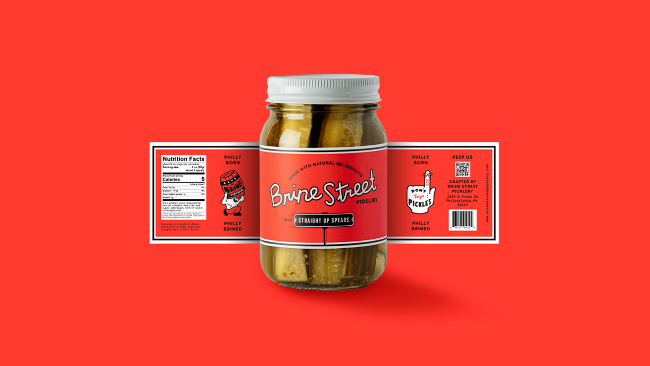
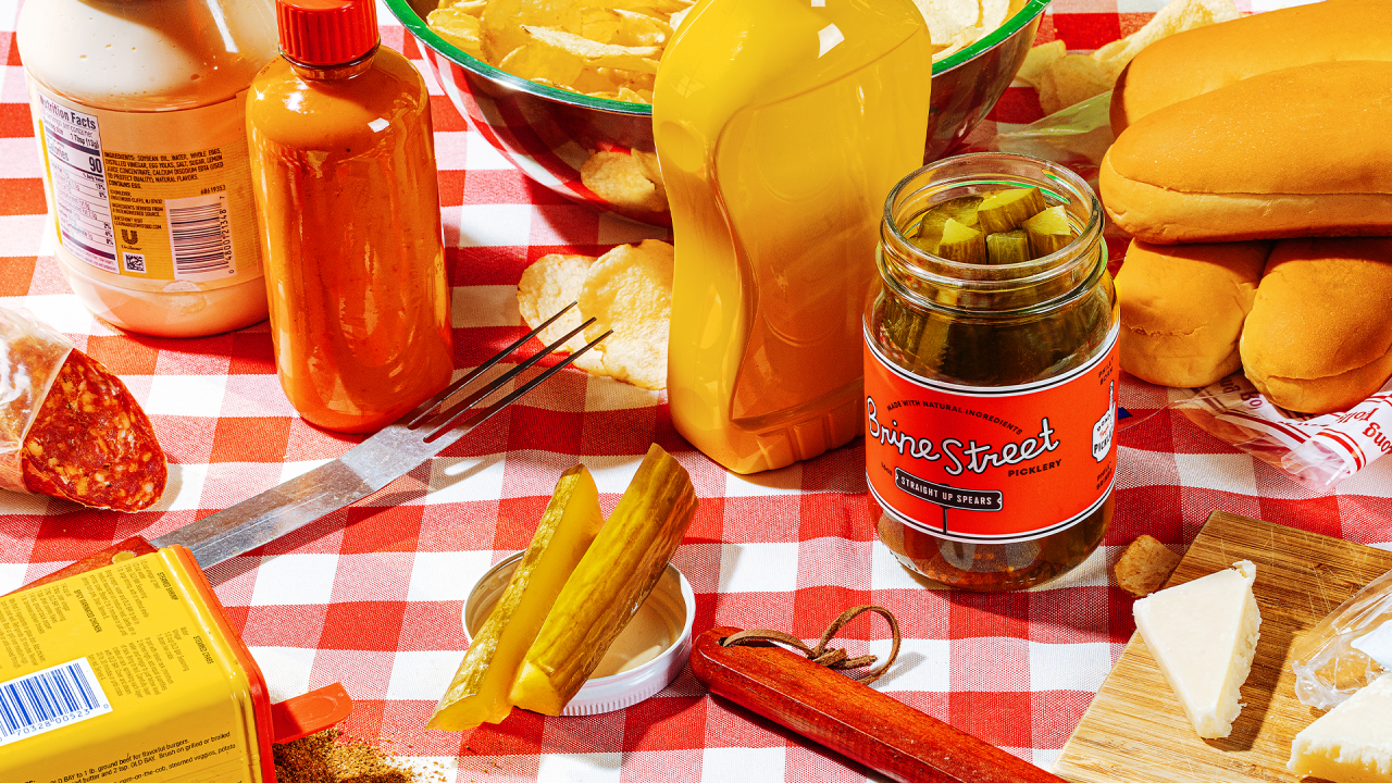
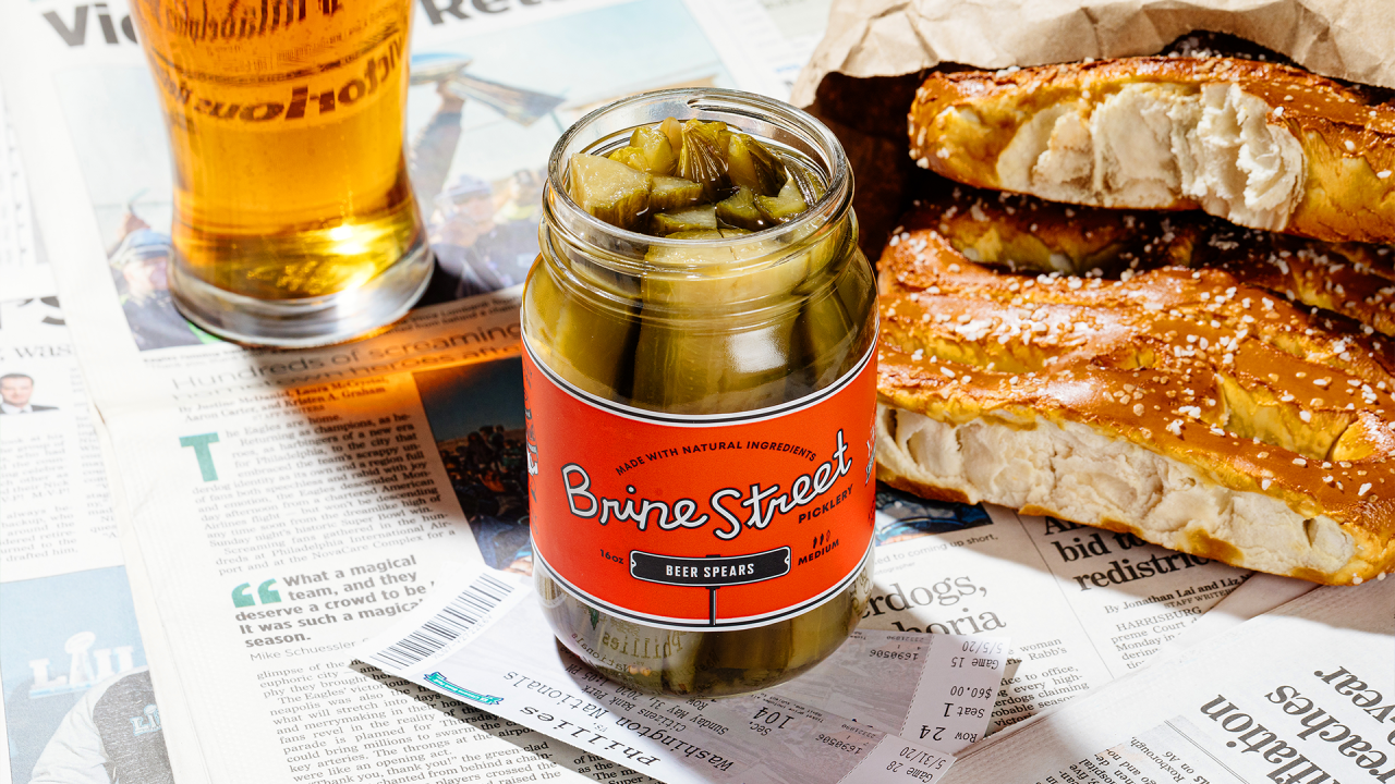
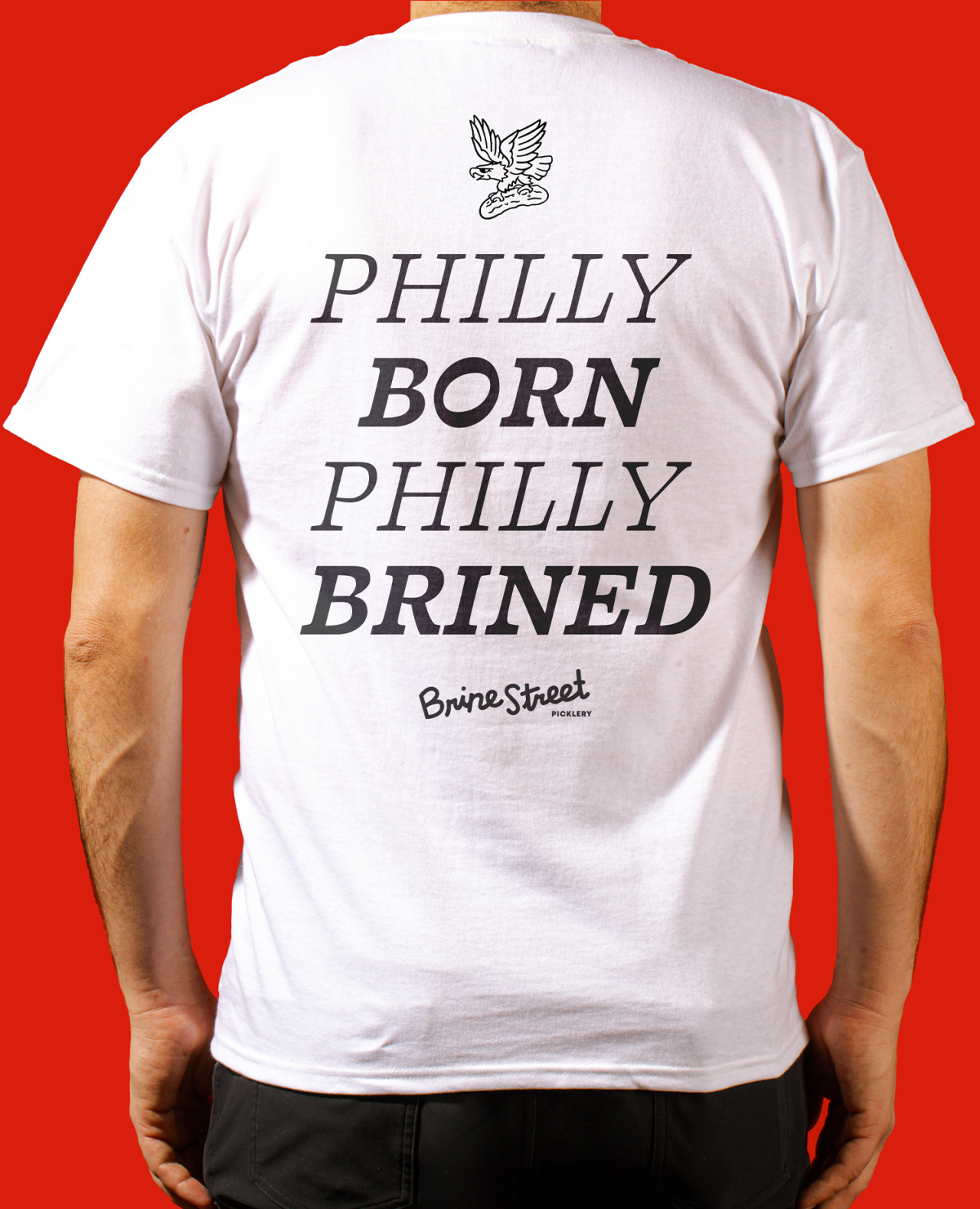
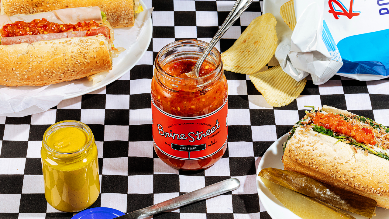
We leaned into a vibrant red for the visual identity, nodding to both Bloody Mary mix and the original spices used in Brine Street’s savory recipes. A hand-done typeface and iconic street sign mark, along with the original tagline “Philly born, Philly brined,” completed the picture of the “pickles for the people” vibe we were going for.
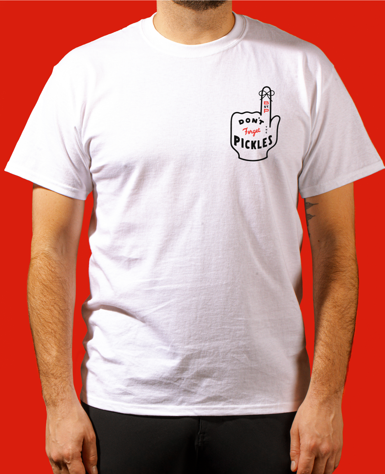
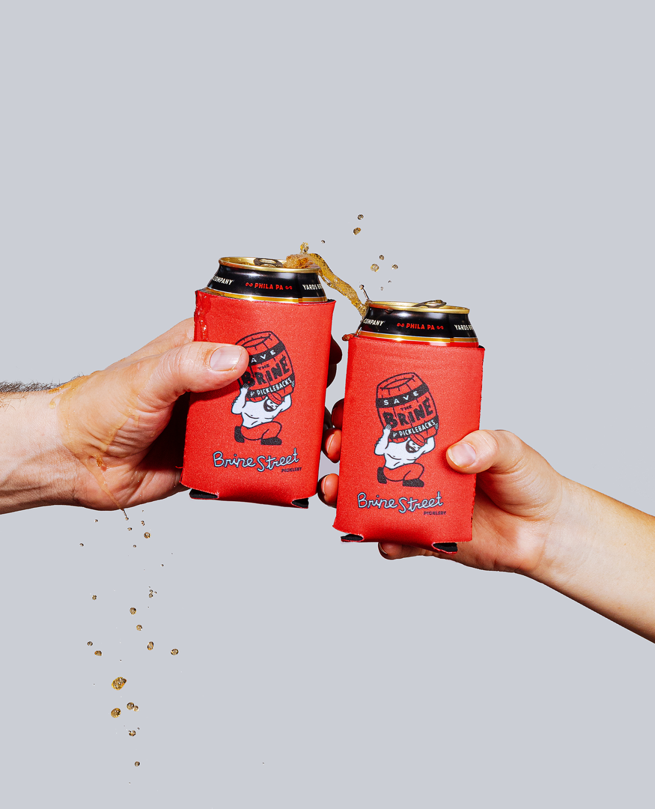
We applied the new design system to collateral including signage, banners, postcards, and wholesale sheets—and created swag like stickers and shirts for Brine Street loyalists. Shout out to Philly-based partner Fuzzy Wooder for the fun brand illustrations, which further enhanced Brine Street’s homegrown roots and gritty vibe.
What started as a small project has grown into a super fun and unique brand world over the years, helping bolster sales and create brand loyalty alongside the super delicious pickles themselves.
- Brand Strategy + Positioning
- Tone of Voice
- Visual Identity
- Packaging Design
- Print Collateral
- Swag