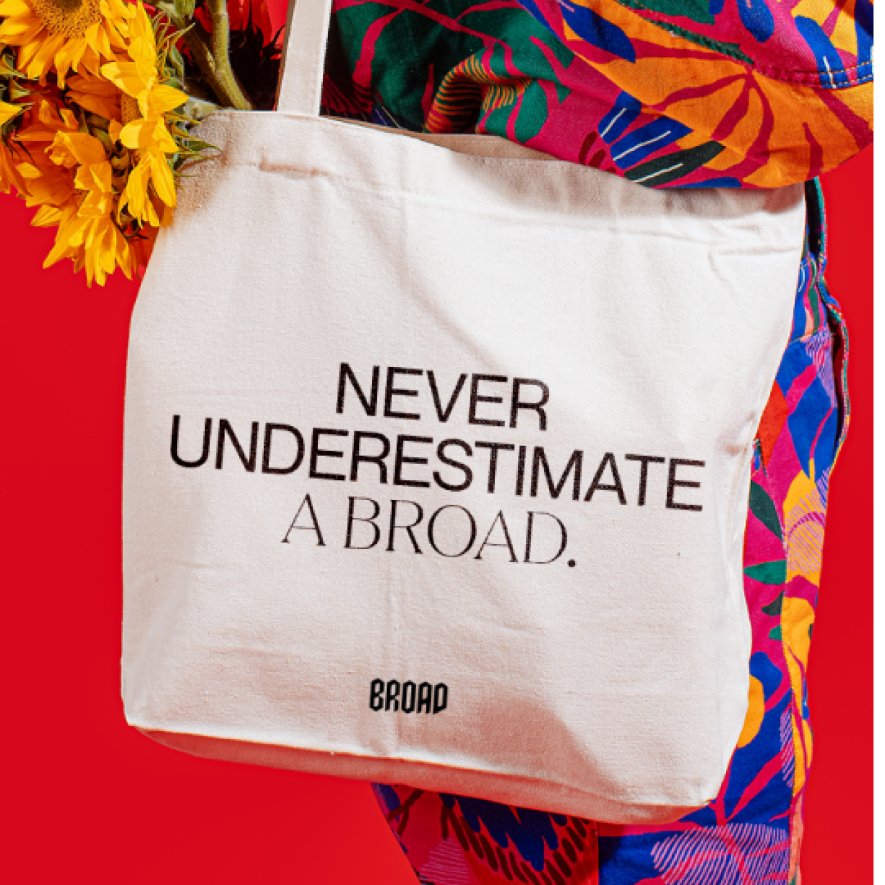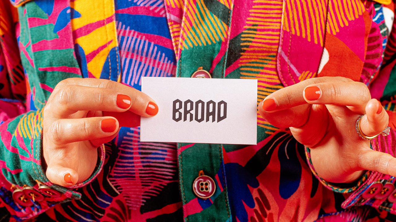
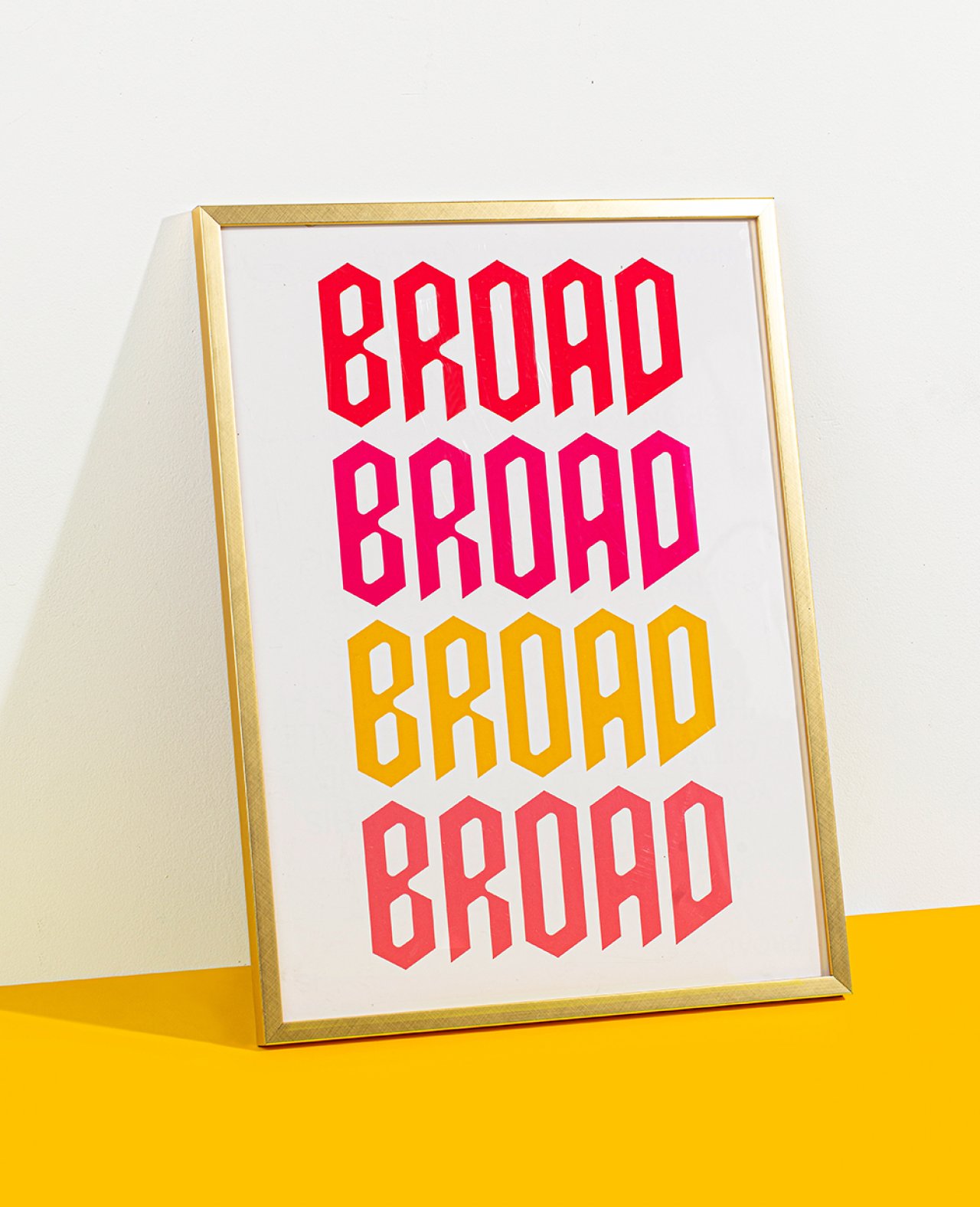
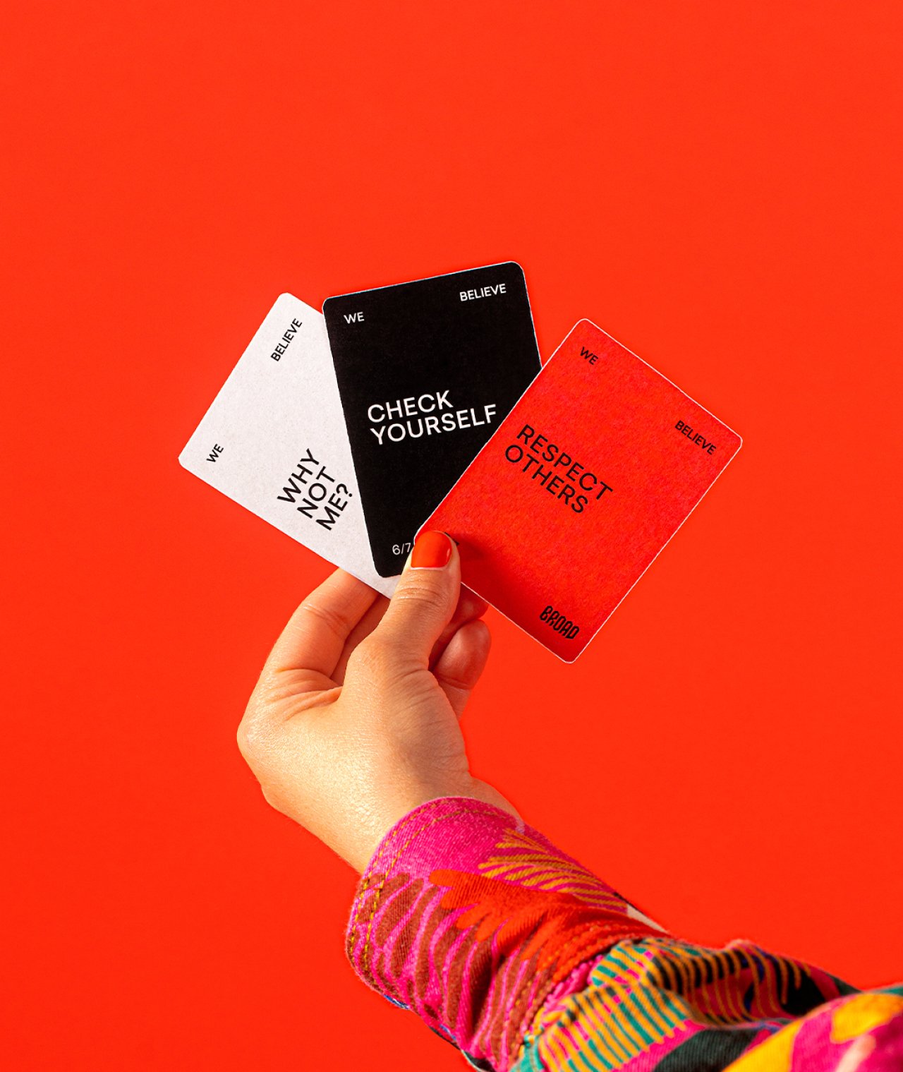
We knew our truth: BROAD is synonymous with bold.
And we had the vision: create a system that felt bright yet gritty, clean yet layered, and resilient yet energizing. Pump electricity through the brand with a saturated color palette with red at its core. Balance femininity with edgy metal blackletter. Mix typefaces to reflect the pairing of our personalities and professional range.
We know things are better when there are more minds in the mix, so we brought in design support from the eloquent and insightful Jeremie Wimbrow to help bring this vision to life—and also to truly tell us when we’ve gone too far. While working with her, we did not miss an opportunity to have fun with illustrations that have deep meaning, yet also no meaning at all.
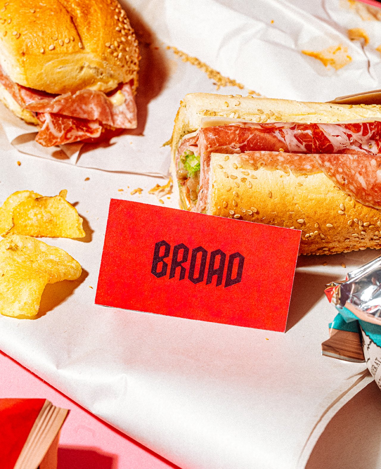
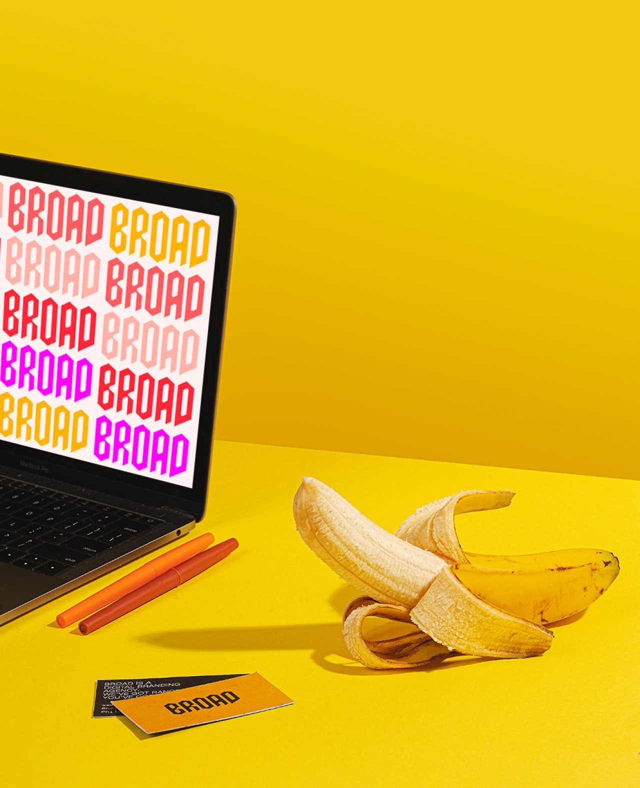
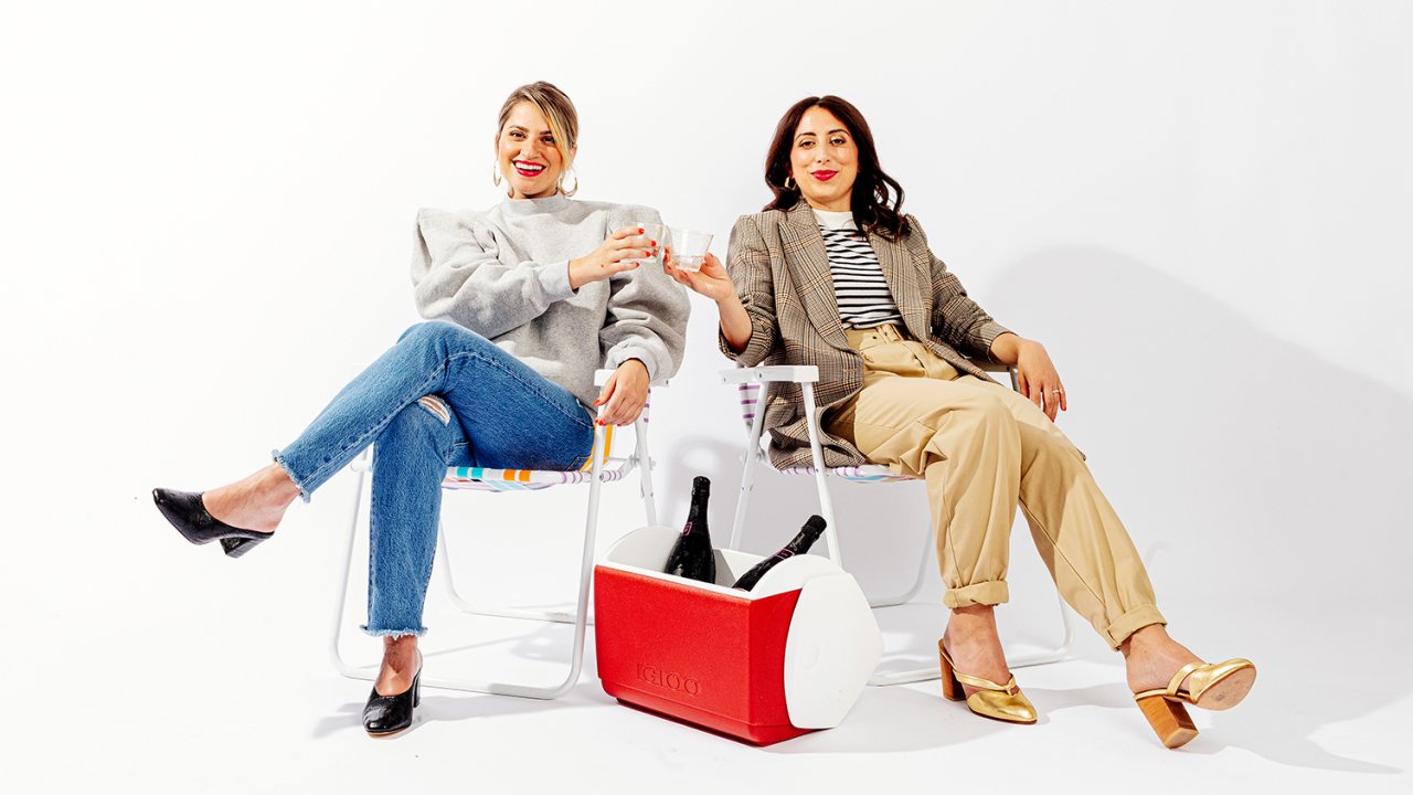
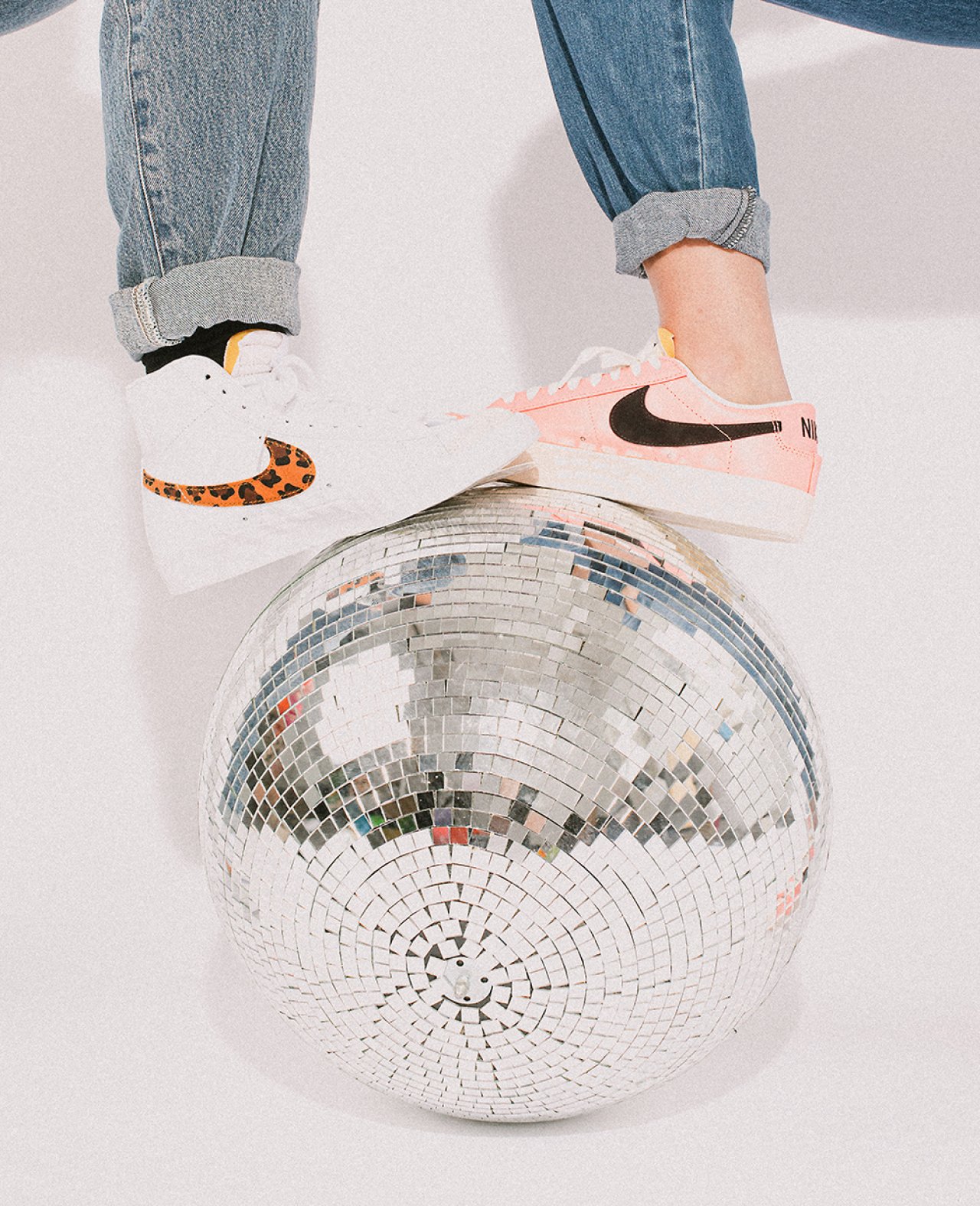
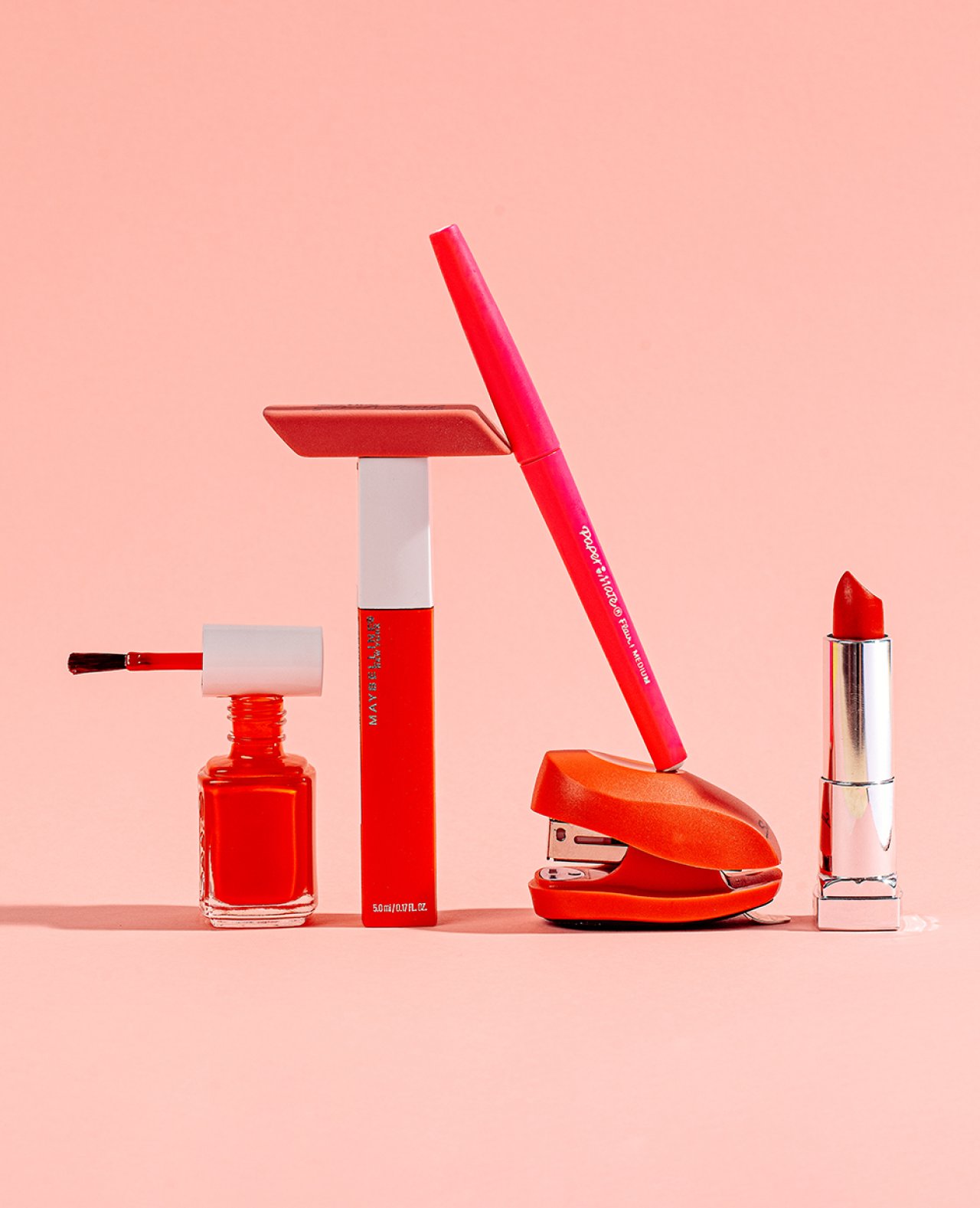
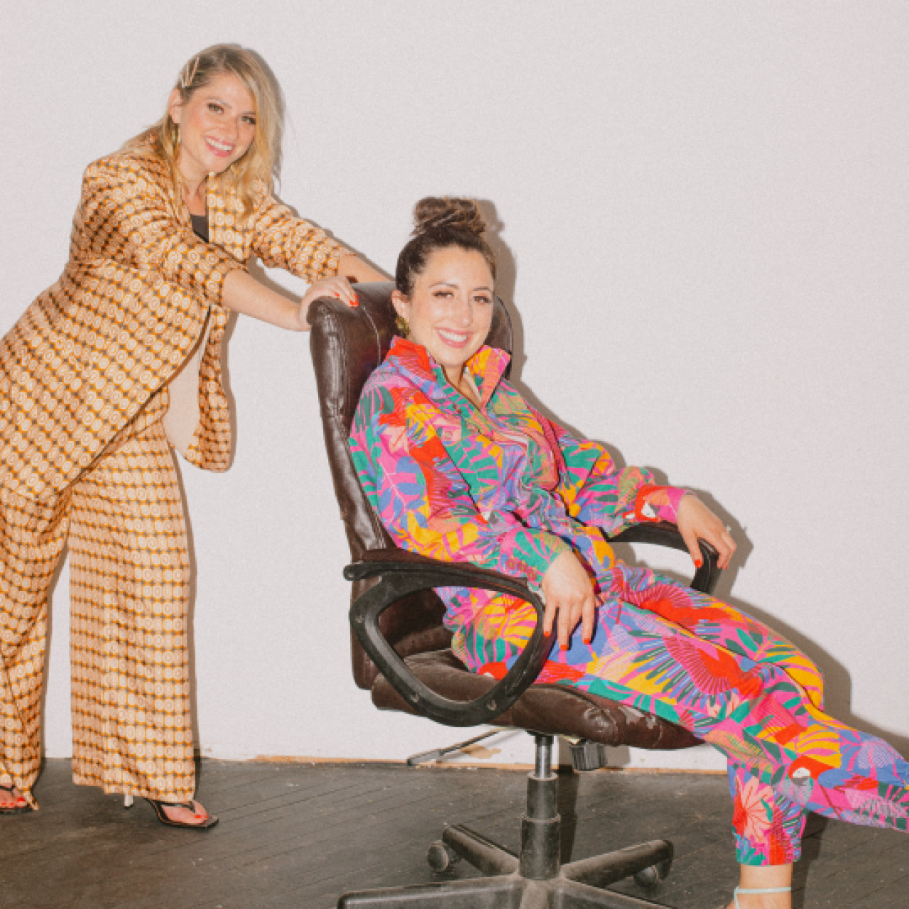
With robust portfolios yet strict limitations on what we could show on this site (at least at the moment), we knew we had to lean into our core offering: ourselves. We worked with the magical and resourceful Bre Furlong to create a set of photography assets that captured us as founders, and the world of BROAD: us chowing down on hoagies with freshly painted lips, popping champagne in Philly lawn chairs, red vines and workout weights, accessories that exist for no reason other than making you feel happy, a shiny disco ball and a weathered toolbox. Shout out to styling by the intuitive and patient Amanda Greyson of Free People, hair and makeup from the oh-so-empowering Stephanie Powers, and production from everyone’s best friend Karissa Fichera.
The way we approach our brand is how we’ll approach everyones: have a vision rooted in authentic insight, assemble the best team to get it done, and never be afraid of being “too much.”